


How to Create Custom Statement Tees That Actually Go Viral (5 Design Secrets)
Look, we're gonna be real with you. MOST STATEMENT TEES SUCK. They're boring, cluttered messes that nobody wants to share, let alone wear. But here's the thing, viral statement tees aren't just lucky accidents. They follow specific design rules that most people are too lazy (or too scared) to implement.
If you want to create custom tees that actually blow up social media feeds instead of collecting dust in closets, pay attention. We're about to drop the 5 DESIGN SECRETS that separate viral hits from forgotten failures.
Warning: This isn't your grandma's gentle design advice. We're talking real, unfiltered strategies that work.
Secret #1: Less Is More (And More Is Death)
Here's what separates the pros from the wannabes: VIRAL DESIGNS KNOW WHEN TO STOP.
The biggest mistake rookie designers make? Throwing everything and the kitchen sink onto a shirt. Multiple fonts, random graphics, ten different colors, and text everywhere. Congrats, you just created visual vomit that nobody wants to look at, let alone photograph for Instagram.
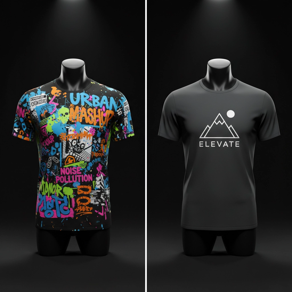
THE MINIMALIST RULE: Stick to clean lines, simple shapes, and a limited color palette. We're talking 2-3 colors MAX. Your design should have breathing room, negative space isn't your enemy, it's your best friend.
Think about the most iconic statement tees you've seen go viral. They're clean, focused, and impossible to ignore because they're not fighting themselves for attention. Your message should hit like a punch, not a gentle tap with a feather duster.
Pro tip: If you can't explain your design concept in one sentence, you're already doing too much. Simplify or die.
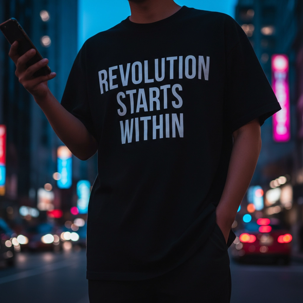
Secret #2: Your Message Better Hit Different
Nobody shares boring shit. PERIOD.
Your statement needs to be powerful, concise, and memorable enough that people want to become walking billboards for your message. The most viral statement tees tap into emotions, whether that's making people laugh, making them think, or making them want to start a fight in the comments section.
WHAT WORKS:
- Witty puns that make people groan-laugh
- Sarcastic phrases that call out society's nonsense
- Bold statements that spark conversations (and maybe controversy)
- Clever wordplay that shows you're actually clever
WHAT DOESN'T WORK:
- Generic motivational quotes everyone's seen 500 times
- Inside jokes only three people understand
- Messages that need a PhD to decode
Your statement should address something people actually care about. Current events, social issues, pop culture moments, or universal truths that make people go "FINALLY, someone said it."
Remember: CONTROVERSY ISN'T ALWAYS BAD. Some of the most viral tees are the ones that make people pick sides. Just make sure you're ready for the attention (both good and bad).
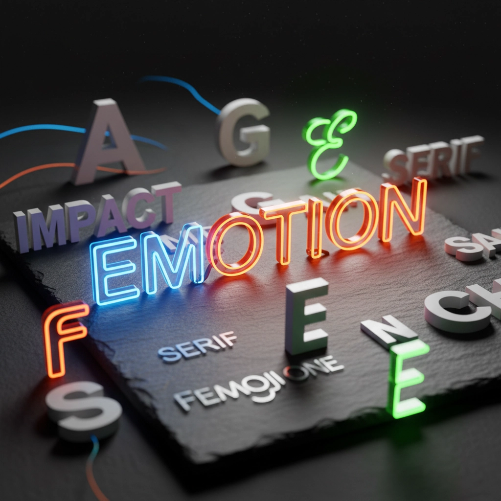
Secret #3: Typography That Doesn't Suck
Your font choice isn't just decoration, IT'S HALF YOUR MESSAGE.
Most people treat typography like an afterthought. They grab the first font that looks "cool" and call it a day. Then they wonder why their design feels off or why nobody takes their message seriously.
HERE'S THE REAL TALK: Your font communicates before people even read the words. Playful fonts for humor, bold fonts for serious statements, clean fonts for modern messages. Mismatch this and you've already lost.
THE TYPOGRAPHY COMMANDMENTS:
- BOLD YOUR MOST IMPORTANT WORDS and put them where eyes naturally go first
- Limit yourself to 3 fonts MAXIMUM (2 is usually better)
- Make sure your main message doesn't get buried by fancy decorative elements
- Choose fonts that match your vibe, don't use Comic Sans for political statements (unless that IS the joke)
Your text hierarchy should be crystal clear. Main message dominates, supporting text supports, decorative elements stay in their lane. If people have to squint or work to read your shirt, they'll just scroll past it.
Secret #4: Master The Art Of Strategic Chaos
Here's where most DIY designers completely bomb: COMBINING ELEMENTS WITHOUT LOOKING LIKE A HOT MESS.
You can't just slap a random image next to some text and expect magic. Successful statement tees use multiple design elements that work together like a well-oiled machine. Text, graphics, background elements, they all need to support the same goal.
THE INTEGRATION GAME:
- Pair motivational quotes with relevant imagery that reinforces the message
- Combine sarcastic phrases with minimalist graphics that add punch without competing
- Use geometric shapes or patterns that frame your text instead of fighting it
- Make sure every element serves a purpose, decoration for decoration's sake is amateur hour
Think of your design like a band. Every element needs to play its part without drowning out the lead singer (your main message). When done right, the combination creates something more powerful than any single element could achieve alone.
REALITY CHECK: If you can remove an element and the design gets stronger, that element didn't belong there in the first place.
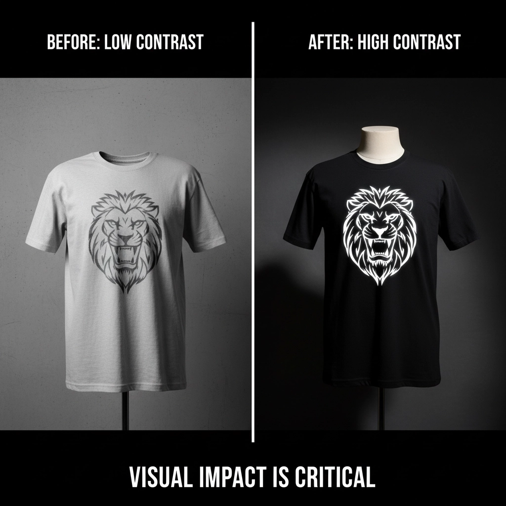
Secret #5: Contrast Is King (And Subtlety Is Dead)
Want to know the difference between designs that pop and designs that flop? CONTRAST.
Your statement tee needs to work in a noisy world. It's competing with a million other things for attention, other shirts, social media posts, street signs, whatever. If your design doesn't have enough visual punch to cut through the noise, it's game over.

CONTRAST STRATEGIES THAT ACTUALLY WORK:
- Dark text on light backgrounds (or vice versa), none of this gray-on-gray nonsense
- One dominant focal point that commands attention immediately
- Strategic use of color to guide the eye where you want it to go
- Size variations that create clear hierarchy (big important stuff, smaller supporting stuff)
Your design should be readable from across a room and instantly understandable in a Instagram thumbnail. If it doesn't pass the "scroll test", looking good while someone's mindlessly scrolling through their feed, it won't go viral.
THE FINAL TEST: Show your design to someone for 3 seconds, then ask them what they remember. If they can't tell you the main message, your contrast game is weak.
The Psychology Behind Viral Statement Tees
Here's the thing nobody talks about: VIRAL TEES AREN'T JUST ABOUT DESIGN, THEY'RE ABOUT IDENTITY.
People don't just buy statement tees. They buy statements about who they are, what they believe, and how they want the world to see them. When someone wears your design, they're essentially saying "This represents me."
The most shareable designs tap into this psychology. They give people a way to express something they've been thinking but couldn't articulate. They become conversation starters, identity markers, and social signals all rolled into one piece of clothing.
VIRAL TEES MAKE PEOPLE FEEL:
- Like they're part of something bigger
- Like they're expressing their true selves
- Like they're making a statement worth making
- Like they found something nobody else has discovered yet
Stop Making Excuses And Start Making Moves
Look, we've given you the blueprint. These aren't theories or maybes, these are proven strategies that separate viral hits from bargain bin rejects.
THE BOTTOM LINE: Great statement tee design isn't about following every trend or appealing to everyone. It's about creating something so focused, so well-executed, and so emotionally resonant that people can't help but share it.
Most people won't follow this advice. They'll keep making cluttered, forgettable designs and wondering why nobody cares. But if you're serious about creating statement tees that actually make statements, you now know exactly what to do.
READY TO PUT THESE SECRETS TO WORK? Check out our collection to see these principles in action, or start designing your own viral masterpiece.
Just remember: IF WE OFFEND YOU WITH OUR BRUTAL HONESTY, PLEASE CLOSE THE BROWSER WINDOW. We make statement tees for people who aren't afraid to make statements.
Now stop reading and start designing. The internet is waiting.